Evolution Craft
Brewing Co.
Interning under a branding manager, I collaborated on various projects, including merchandise design, menu design changes, and beverage branding. By utilizing my design skills, I was able to create merchandise that aligned with the brand's messaging and resonated with its customers. Working closely with a branding manager allowed me to develop a deeper understanding of the brand's values and messaging, ultimately resulting in successful design solutions.
Merchandise
Here's a refined and expanded version of your description that adds more depth and flow:
During my internship, I had the exciting opportunity to create merchandise for Evolution Craft Brewing Co., a project that allowed me to blend creativity with the brewery's unique identity.
For my first design, I wanted to capture both the essence of the brewery and its East Coast roots. I envisioned a design that incorporated water, an important element given the brewery's coastal location, and something that would reflect its surroundings. My idea centered around a large draft beer positioned over a body of water, with the reflection of the company name, “Evo,” rippling across the surface. To create the illusion of water movement, I distorted the letters, mimicking the natural ripple effect. The draft beer was designed with 3D depth, achieved through line work and shadowing, with the sun peeking from behind to add dimension. For the foam, I used soft, cloud-like shapes that seamlessly blended with the cloud-filled sky in the background. To complete the design, I framed the scene with a border, incorporating overlapping elements that gave it a more dynamic, lifelike quality. For the color palette, I chose a minimalist approach, using only three colors: a blueish-teal for the water, a dull yellow for the sun, the beer, and the reflection of "Evo," and black for the shadows, border, and finer details. The use of white allowed the design to adapt seamlessly to any light-colored apparel, ensuring versatility.
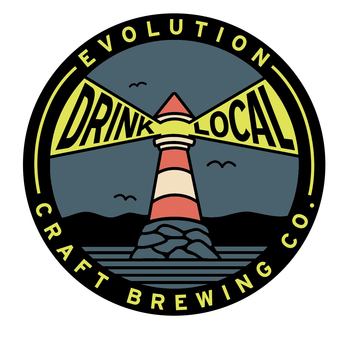
For my second design, I aimed to incorporate the phrase “Drink Local,” celebrating the brewery’s small-town roots. Additionally, I was challenged to make the design suitable for embroidery, which required me to keep it bold and simple. I decided on a lighthouse as the central image, with the words “Drink Local” illuminated by the light beams shining from either side. To create a sense of motion, I skewed the lettering to follow the beams, with the text growing larger as it ascended. The final touch was a thick border surrounding the design, with the company name wrapping around the entire emblem. For the color palette, I chose muted tones for the background, rocks, and water elements, but used a vibrant greenish-yellow for the key elements: the lighthouse’s light and the company name in the border. This provided a striking contrast that made the design pop, while still maintaining a cohesive and bold look. The darker blues and greys in the background allowed the lighter elements to stand out clearly, while the overall design remained easy to read and suitable for embroidery.


