Empowering each individual with a sense of belonging, You’re Needed Here is dedicated to fostering a community where everyone thrives. Through shared resources, education and encouragement, we strive to support the greater good, guiding each person on their journey through life.
"You're Needed Here" is an Instagram account created by my cousin Christi and me, with a shared passion for both helping others and EDM music. Christi, a registered nurse in Tampa, Florida, is deeply committed to supporting people in need. She frequently travels to music festivals and saw an opportunity to combine her love for festivals with her desire to provide vital resources. The page is dedicated to sharing information like nearby towing services, medical tent locations, places to purchase Narcan, and much more. She also aims to raise awareness about mental health and addiction, working to break stigmas surrounding these important topics.
Christi's passion for this project has been a huge inspiration to me, and I felt incredibly honored when she invited me to be a part of it. Together, we wanted to make this vital information not only accessible but also visually engaging—blending functionality with art. While Christi curates the resources and compiles the information, I handle the design and content creation for the Instagram page.
Looking ahead, we hope to become a more active presence at festivals, setting up booths that offer important information in creative ways—whether through stickers, cards, or small booklets. Our goal is to empower festival-goers with knowledge, while ensuring the message is both helpful and inspiring.
Branding
For branding, we chose the name "You're Needed Here" as a reminder that everyone is valuable and has a place in this world. I designed an earth-inspired logo to symbolize that message.
We also opted for a fun, energetic typeface and vibrant colors to keep the page lively and engaging, balancing the weight of some of the serious topics we address.
Body Dysmorphia Awareness Post
For my recent project on Body Dysmorphia Disorder, I aimed to create a design that was bold and impactful while still conveying the message clearly. I began with an image of arms and legs, intentionally excluding the full body, and applied a duotone effect using pink and blue tones. These colors became a key element throughout the design, creating a cohesive and visually striking look.
I chose the KC Uppercut typeface from Kern Club for its distorted lettering, which I felt perfectly captured the essence of Body Dysmorphia. The contrast between the thick and thin strokes added an artistic flair and reinforced the theme of perception versus reality. With Instagram's recent update allowing more than 10 images in a carousel post, I made sure not to overwhelm each slide with too much information. Instead, I focused on keeping the text clear and legible, allowing each image to communicate its point effectively without feeling crowded.
Lost Lands
Festival Resources
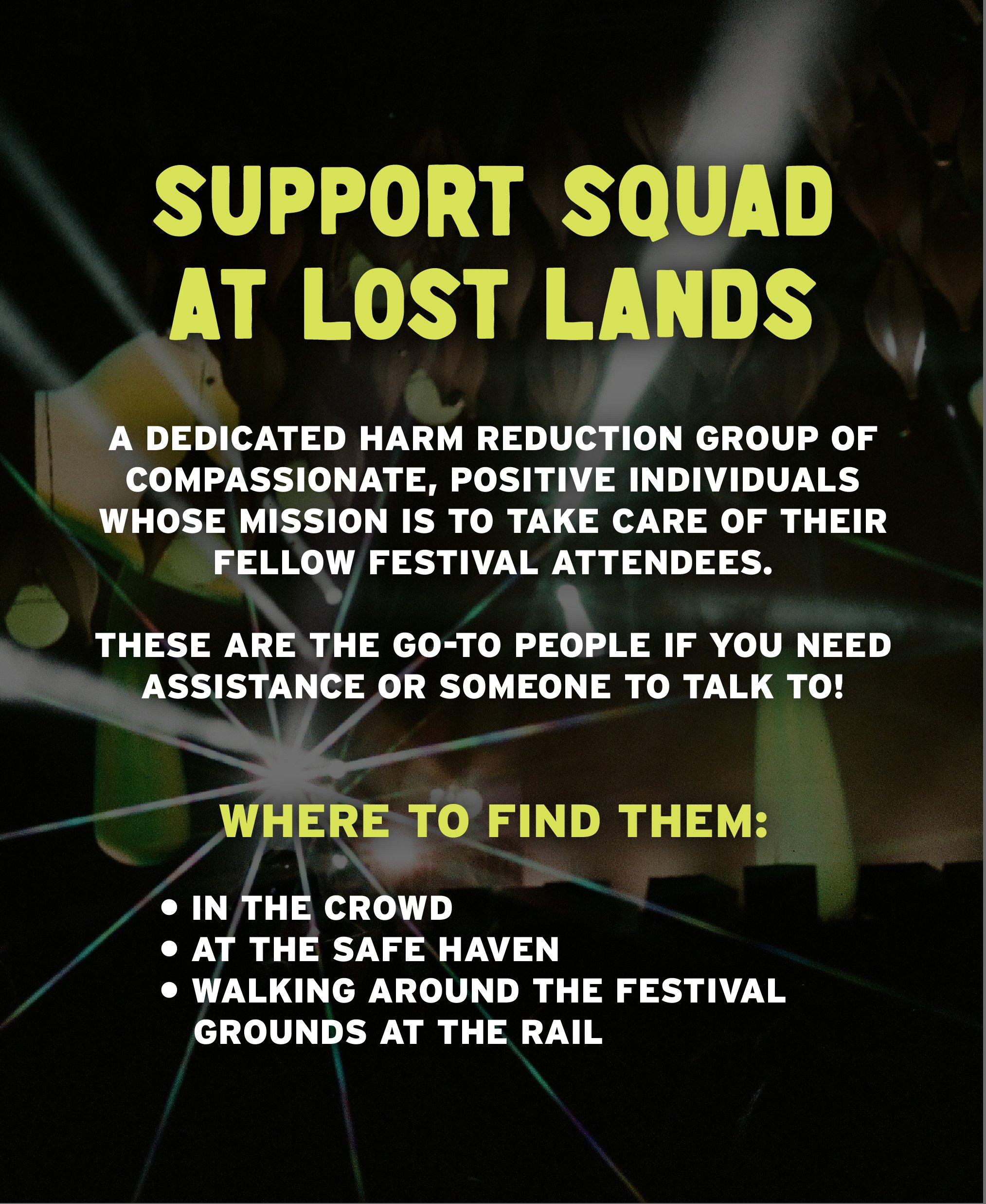
For our Lost Lands Festival post, I used a photo that Christi had captured at the previous year's event. To make the text legible, I applied a black overlay to darken the image while still allowing the photo to shine through. Using our brand's signature yellowish-green color, I established a clear hierarchy of information, highlighting slide titles and key details in that color to ensure they stood out.
Additionally, Christi attended the festival with her close friend Gabriel, who performs as Zingara, and together they hosted a vision board creation class. Christi went around the class, handing out goodies like our stickers and business cards, which featured a QR code linking to a downloadable PDF with essential festival information, similar to our Instagram post. The document also included critical mental health helplines, instructions on how to administer Narcan, and other valuable resources. Proud cousin moment!
Narcan Awareness Post
To help raise awareness and combat the stigma surrounding substance abuse, Christi and I decided to create a post focused on Naloxone and its life-saving uses. We shared key facts about opioid-related overdoses and how Naloxone can reverse them, as well as providing information on where to find it, when to use it, and how to administer it. For the design, I traced an illustration of a hand holding the Narcan device, poised to administer it, using two of our brand colors to create depth and contrast. I then applied these colors throughout the post to maintain consistency and highlight the most important information, ensuring the message was clear and impactful.
Men’s Mental
Health Awareness Post
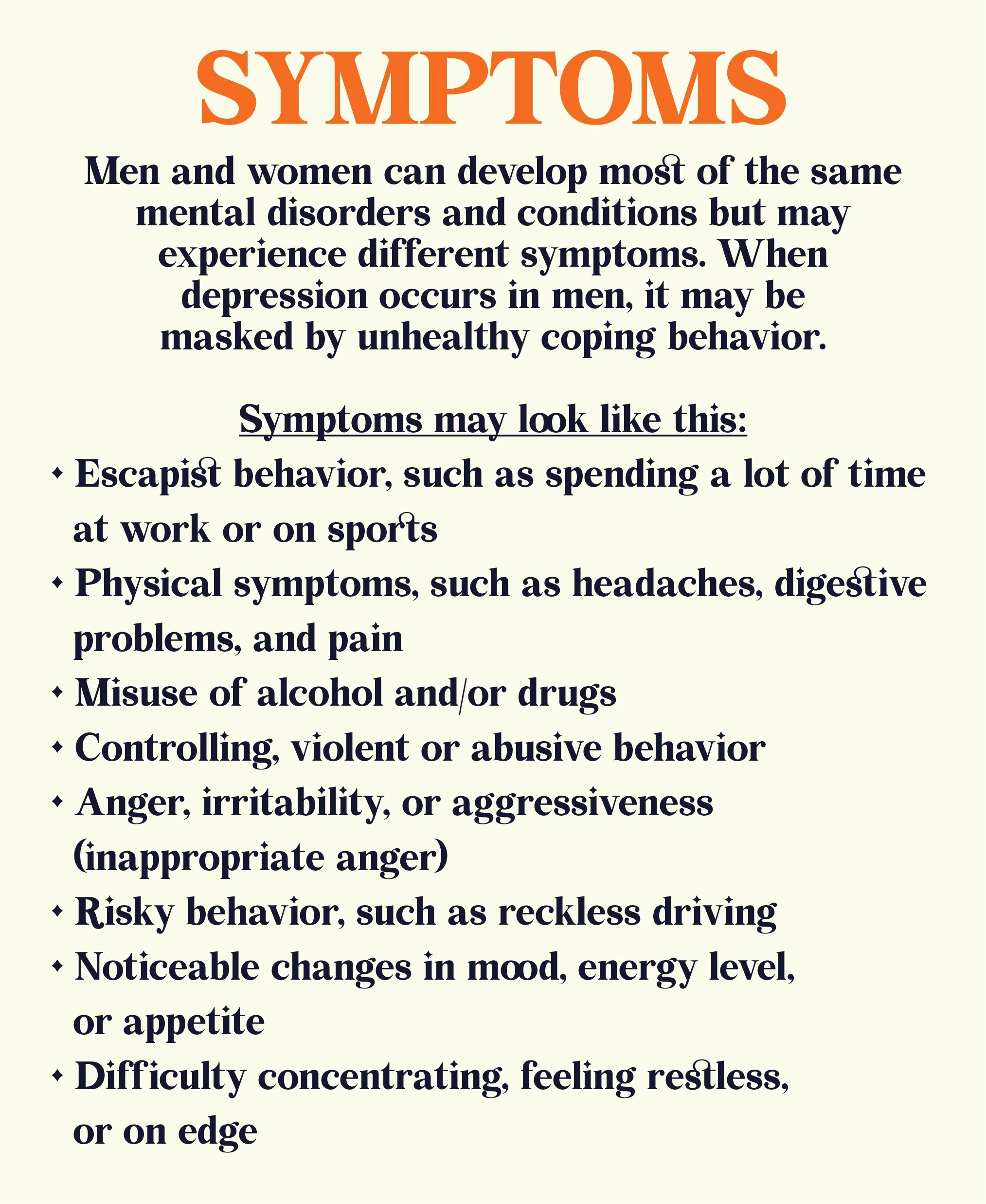
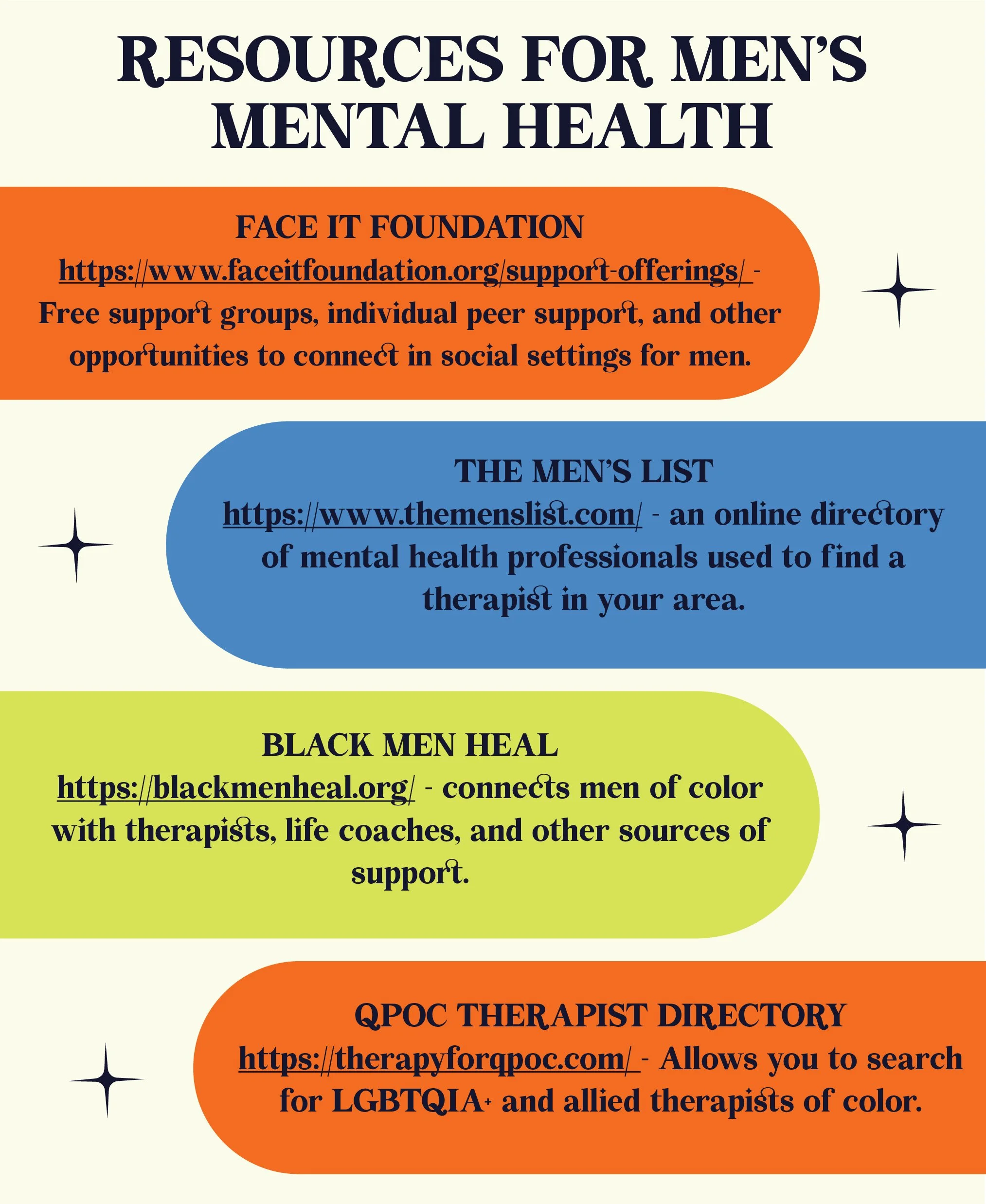
To help raise awareness about Men's Mental Health and challenge the stigma surrounding toxic masculinity, my cousin and I collaborated to present key facts, warning signs, and available resources in an engaging and artistic format. Our goal was to communicate these important messages in a way that resonates and captures attention.
In the second post, we focused on the troubling statistics surrounding men's mental health in comparison to women. I designed a circular infographic that visually represents the disparity: the number of men and women affected by mental health issues, as well as the stark contrast in how many seek help. This visual comparison highlights the unfortunate reality that men are significantly less likely to reach out for support, emphasizing the need for change.
For the overall design, I chose a vibrant, balanced aesthetic—one that strikes a harmonious tone, avoiding extremes of masculinity or femininity. The goal was to create a look that feels inclusive, approachable, and dynamic, drawing attention to the cause while making it accessible to all audiences.
By combining powerful data with compelling visuals, we hope to inspire open conversation, reduce stigma, and encourage men to seek the help they deserve without fear of judgment.
Check out our Instagram to see more!


